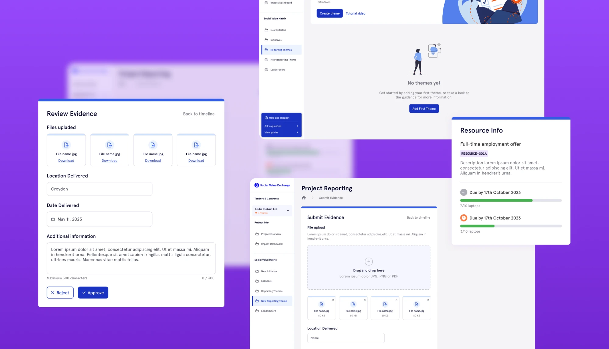
Discovery & Experience Definition
Three core user groups were identified early: procurement officers, suppliers, and small community organisations. Research focused on their distinct needs, from oversight and bidding motivations to onboarding constraints. Working closely with the founders ensured that legal and procurement requirements were reflected clearly in the product's flows, shaping the initial user journeys and clarifying how accreditation, auction participation, and reporting states fit together within the system.
Information Architecture & User Flows
The dashboard needed to work for three quite different user groups, all operating within the same underlying data model. User flows were defined for onboarding, auction creation and participation, filtering and discovery, reporting, and resource verification.
With a high volume of sensitive procurement data to present, information hierarchy was a priority. Progressive disclosure was used to surface the most important signals first, with the option to dig deeper where needed. The goal was to make things feel simpler without stripping out the detail that mattered.
Wireframing & Interaction Prototyping
Wireframes were used to validate navigation, auction mechanics, and dashboard clarity before any visual design was introduced. Interactive prototypes in Figma then tested the bidding interactions, credit allocation logic, and how information was shared across different user roles. Translating the e-auction model into an intuitive interaction pattern took particular care: Social Value Credits and competitive resource pledging needed to feel transparent and fair, while staying compliant with procurement standards.
Design System & High-Fidelity UI
A design system was built to support consistency and make the product easier to scale over time. Foundational elements including typography, spacing, colour, variables, and reusable components were established during the transition from wireframes to high-fidelity UI. Components covered dashboards, data tables, filters, status indicators, and reporting modules. Colour was used semantically to communicate auction states, accreditation progress, and reporting signals, not for branding. Close collaboration with the developer throughout ensured a smooth handoff and reduced guesswork during implementation.